DiabeTV
DiabeTV is a virtual place conceived to inspire diabetic people. Through scientific information and practical tips the company's objective is to convince people that diabetes is not an obstacle to enjoy a healthy, long lasting, and productive life. DiabeTV has put together an interdisciplinary team that permanently looks for the most recent and advanced information from a variety of fields and distributes these information through social media channels and a blog.
PROJECTS DATES: 2014 & 2018
INDUSTRY: Healthcare
CAPABILITIES: Brand & Identity Design | Brand Strategy | Brand Management
PROBLEM STATEMENT:
To design the new brand identity and its applications for the new company. The challenge was to showcase DiabeTV's innovative approach to inspire and guide diabetic people through the design of a strong brand.
OBJECTIVES:
Develop a brand strategy for establishing and reinforcing DiabeTV's reputation within the local & international community.
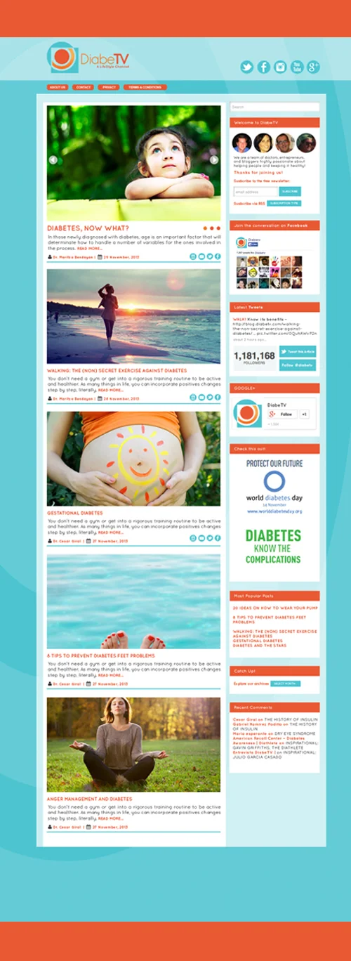
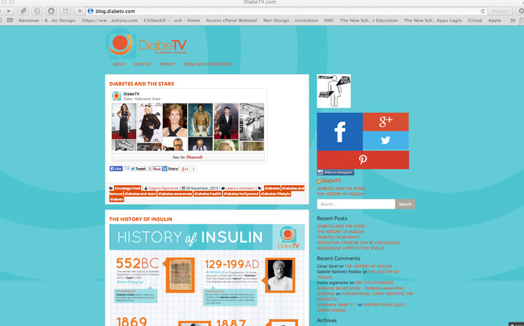
Design the look & feel for the blog.
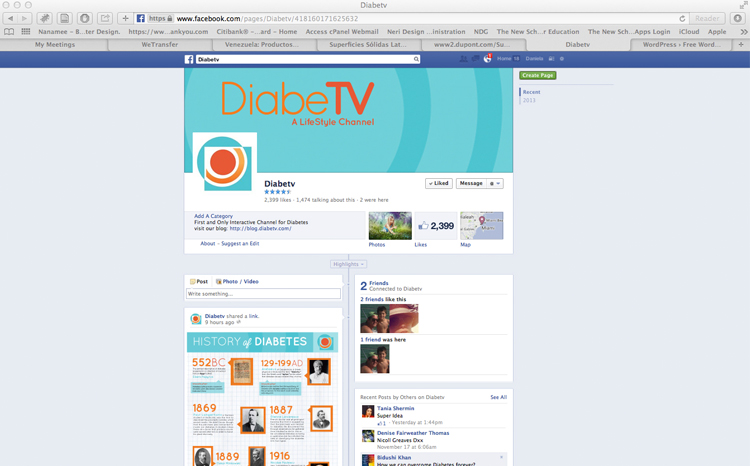
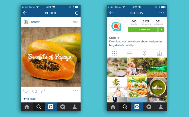
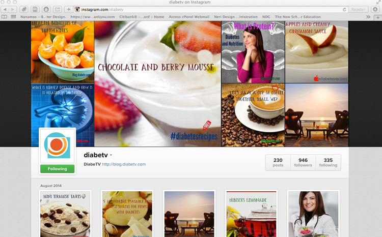
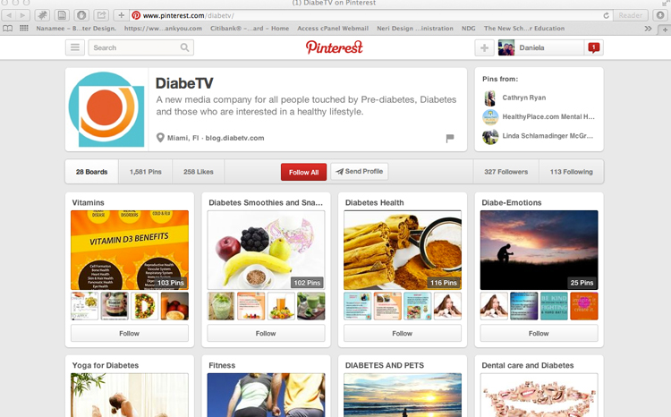
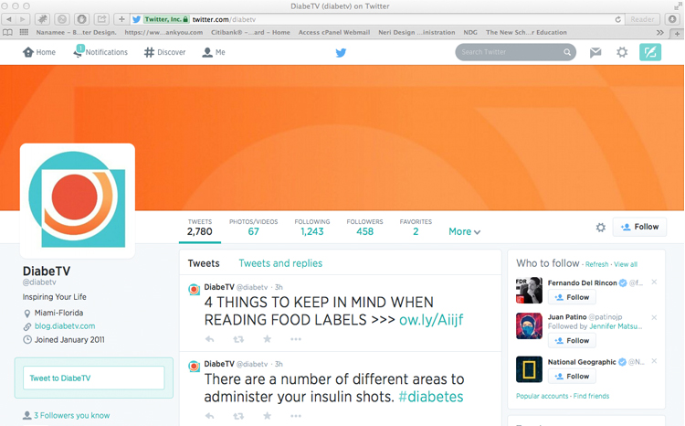
To carry the brand through to social media platforms: Design custom skins, favicons & avatars for the following: Instagram, Youtube, Facebook, GooglePlus, LinkedIn, Pinterest, Tumblr & Twitter.
Design infographics and templates for presentations and promotional material, both digital and printed.
RESULT:
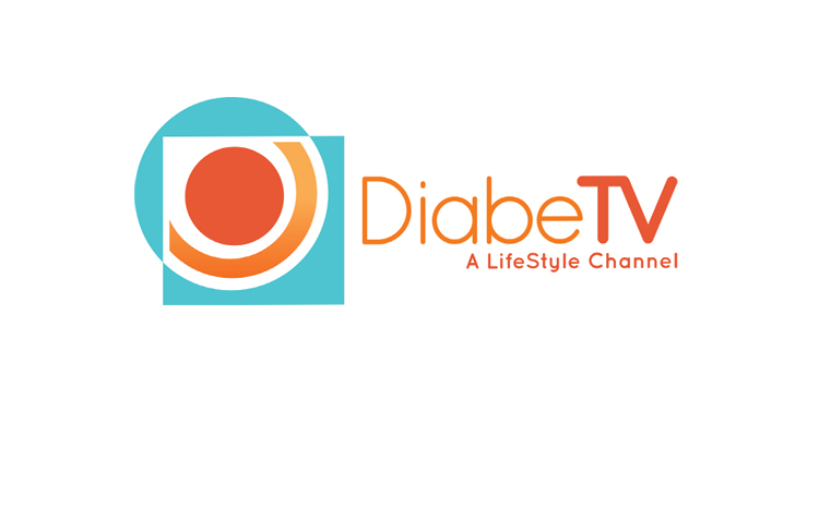
Being inspired by Sacred Geometry, which “is a master key to expanding human spiritual awareness; to healing the physical body and correcting energetic problems”, according to a specialist in the subject matter and writer Bruce Rawles. I designed DiabeTV's logo using shapes such as, circles and squares in order to create a friendly, upbeat icon. The circle representing: unity, wholeness and protection and the squares representing: structure and foundation, convey the key values of the brand. The orange circle with the gradient band that goes underneath it, depicts a person reaching up to the sky, portraying hope and optimism. The color orange radiates warmth and happiness, and the color cyan recharges one’s spirit during times of mental stress and tiredness, invigorating one’s mood and promoting tranquility. The chosen typography conveys the brand’s tone of voice and personality, being friendly, contemporary, happy and fresh.
BRAND IMPLEMENTATION
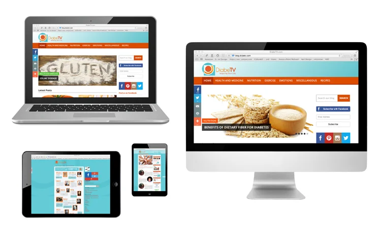
Web & Mobile Devices
Social Media
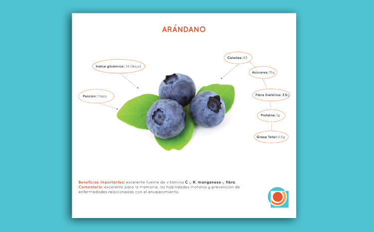
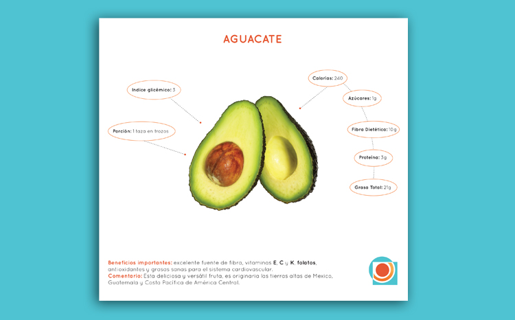
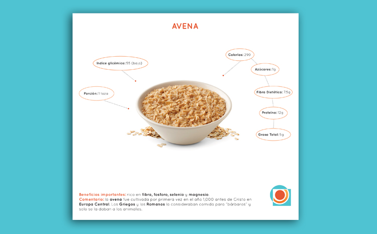
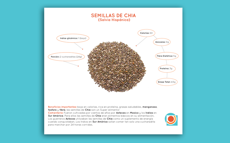
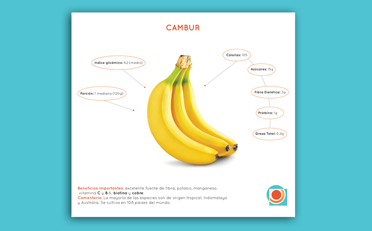
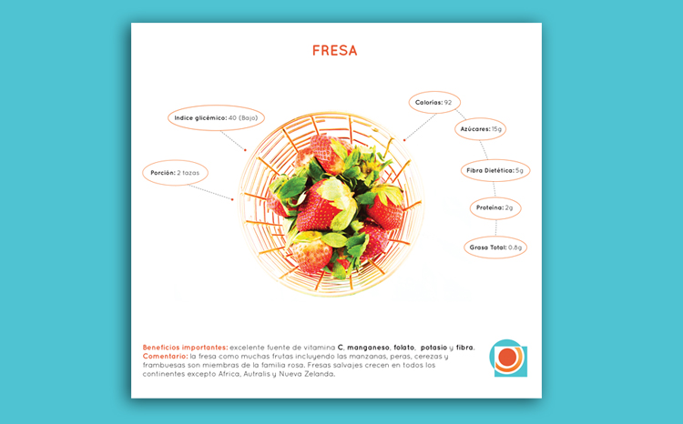
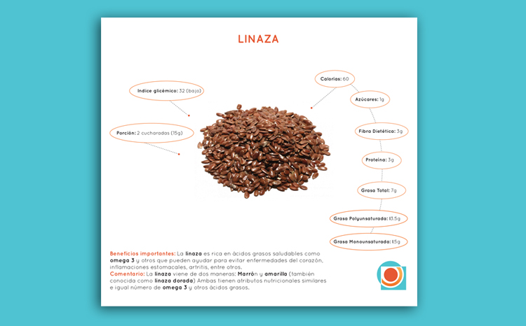
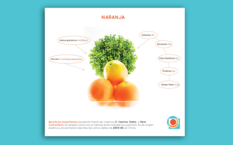
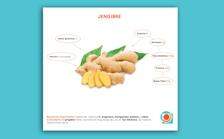
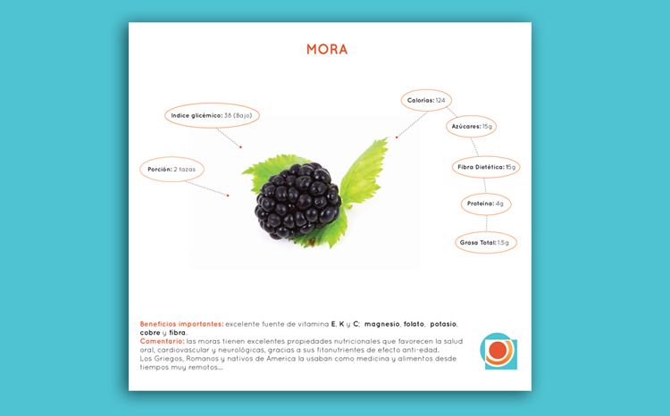
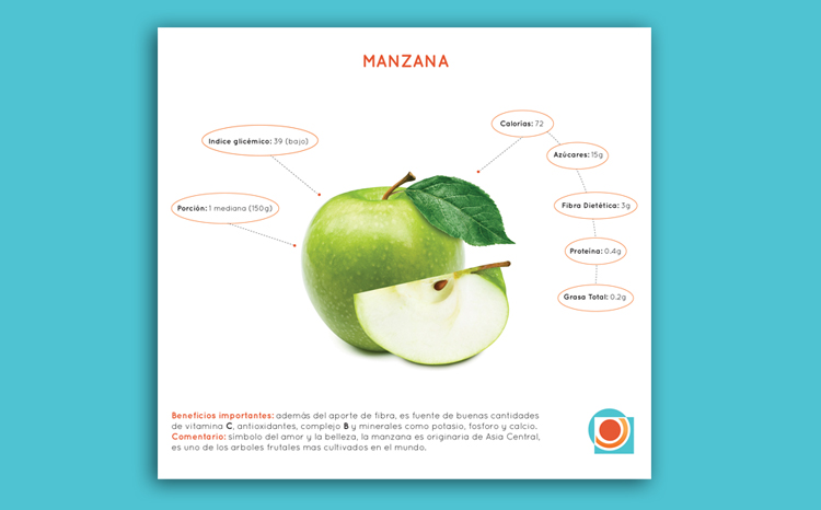
Infographics
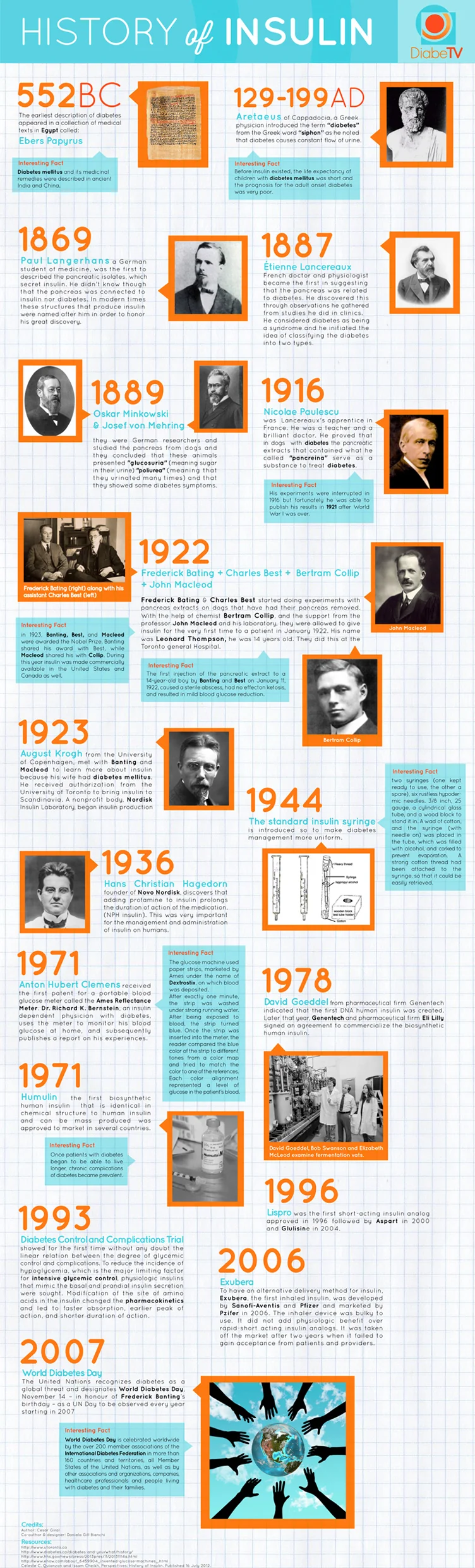
Infographic for The History of Insulin